Perception in Photography & Printing: How We See and Share Images
Ever wonder why some photos just feel right while others fall flat? The secret is perception – the way our brain reads colors, shapes, and light. In photography and printing, perception decides whether an image pops or disappears. Understanding it lets you shoot smarter and get prints that truly match what you saw on your phone.
Why Perception Matters in Photos
Our eyes don’t see the world exactly as a camera does. A bright sky can look softer, shadows can seem deeper, and colors can shift based on surrounding tones. When you frame a shot, think about the visual hierarchy – what you want viewers to notice first. Place the main subject on a contrasting background, and keep clutter to a minimum. This guides the brain to focus where you intend.
Lighting also tricks perception. Soft, diffused light flattens textures, making skin look smoother, while harsh light emphasizes details. If you’re shooting a product, use a few lights at different angles to control shadows and highlight the shape. The result feels three‑dimensional even on a flat screen.
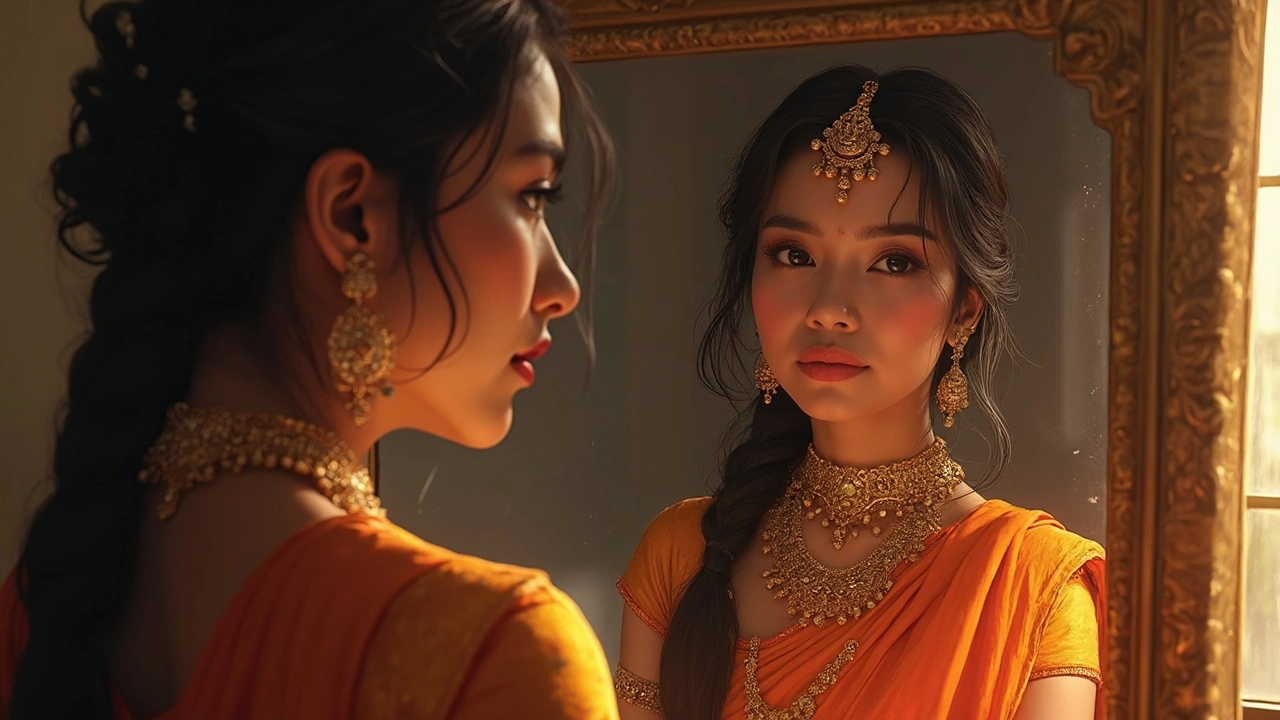
Color perception is another game‑changer. Our brain interprets colors based on context. A red shirt next to green foliage stands out more than the same shirt against a red wall. Use this to your advantage: choose backgrounds that make your subject’s colors pop. When you edit, avoid over‑saturating; a little boost can make the image lively, but too much can look fake and hurt how people perceive it.
Boosting Perception in Your Prints
Printing adds another layer of perception. Ink, paper, and finish all alter how colors appear. A glossy paper makes colors vibrant, while matte reduces shine and can soften contrast. Pick a paper that matches the mood of your image – bold photos look great on glossy, delicate portraits feel natural on matte.Before you hit print, do a test strip. Print a small strip of the image using the exact settings you plan for the full size. Look at it under daylight; if the colors look off, adjust the printer profile or tweak the image in your editing software.
Resolution matters for perception of detail. A 300 dpi image printed at the right size keeps edges sharp and textures clear. If you stretch a low‑resolution file, it looks blurry and the brain immediately notices the lack of detail.
Finally, consider viewing distance. A large poster viewed from a few feet away can tolerate less detail than a small photo held in the hand. Scale your editing and printing choices to where the image will be displayed.
By keeping perception in mind – from framing and lighting to paper choice and resolution – you can create photos that look great on screen and keep that same impact when they’re printed. Try one tip today, like adding a contrasting background, and see how quickly your images start to feel more powerful.